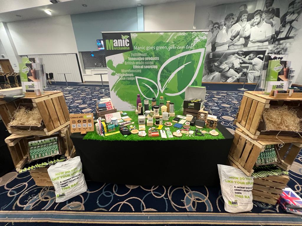
Can you guess how long your stand has to get a passers-by attention at an exhibition?
7 seconds.
In that time, you should have enticed your potential clients enough to stop and talk with you rather the all the other exhibitors they will be passing. But how do you stand out?
With over 15 years Marketing and Visual Merchandising experience working with some of the biggest retailers in the U.K including New Look and Selfridges, I’m going to tell you the top 6 ways you can make an impression. They may seem simple but get overlooked a lot more than you would think.
1. SYMMETRY
Lay out products on your table or display symmetrically.
The human eye finds symmetry attractive, according to the American scientist Alan Lightman, human brains actually strive to see things symmetrically. “The reason must be partly psychological,” he says. “Symmetry represents order, and we crave order, It helps us make sense of the world around us”.
This doesn’t mean every item should be placed in exactly the same place on each side but if you are setting out products on the left to a slant, then place the items on the right to a slant. If you’ve added height at the back of one side, add height to the other side too.
2. Layout PRODUCTS within their ’Family’
Make it easy for your customers to find what they’re interested in. Eg Tech items with tech. Keep paper items next to Pens etc. This makes it easy for them to navigate the display in case someone isnt available to speak with them immediately.
3. Mountains and valleys
The more levels you add to your display the more you are keeping the viewer interested. A flat display can be dull and doesn’t highlight anything. Use small stands or boxes to place some of your key items on to help them stand out.
Anything very tall (mountains) should be at the back of the display not to over shadow the smaller and lower items at the front (valleys).
4. Eye catching backdrop
Your backdrop should be 3 things
– Branded with your logo and a brief description of what you offer.
– Big enough to make a statement (and also to hide the mess from the other exhibitors behind you in some cases.)
– Compliment your stand with the same colour tones used so it feels part of the overall display.
5. Consider the customer journey.
Once set up, walk up to your stand from the same way the main footfall will be coming.
Is it impactful? Is anything blocking the main part of the stand that may need to be adjusted? Can you clearly see your branding on approach?
Seeing the stand through the eyes of your potential clients will give you a better chance of success in making notice and stop to speak to you.
6. Make people remember you!
Give away branded products that speak about you as a company. Avoid doing the usual bottle or pen that so many other exhibitors will also be doing – because lets be honest , is that going to get you remembered?
We specialise in something different and can work with you to make sure you are giving away something useful, interesting and not wasteful.
Some examples of how we matched up companies with the perfect promo items are ;
The Cricket world cup – They wanted something Eco that would cause a media stir. We came up with branded Apples – Impactful and sure to be shared on social media with your logo on!
Censornet, a Traffic management company – Biscuits in the shape of traffic lights and multi cables to reflect the companies ethos about connectivity.
AM Forktrucks , Forklift company – To reflect their carbon fibre hard ware look used across their fleet , we made a variety of promo items using an exact image of this fabric alongside their logo to represent their brand.
Norwegian Air and Gatwick airport – To celebrate their new route to New York we came up with the idea of Peanut butter and strawberry jelly beans and foam hat that represented the statue of liberty (again a big social media hit!)

